
What is a Website Redesign?
A website makeover involves making significant modifications to your website. During a redesign, your site’s software, content, arrangement, and visuals may all change substantially, giving it a whole new look.
This is a natural—and important—part of the website building process. As many as 50% of consumers believe that website design is a significant aspect of a company’s branding.
Even if you had the best website in the world back in 2001, it would look quite out of place now if you didn’t make any significant changes to it.
Design best practices evolution, technology evolves, and your target audience’s expectations shift; your website must adapt to stay up.
Accessibility is also an important consideration. When visiting a website for the first time, 38% of visitors will look at the design of the page or navigational links.
Your website is the foundation of your digital marketing strategy. As a result, there are several reasons to revamp your website in 2025. In this piece, we will look at six techniques to improve your website.
Why You Should Consider a Website Redesign
Your navigation provides a challenge
When your audience visits your website, you want them to be able to simply navigate its pages. You do not want people to strain to find the information they require. If your navigation is bad, your audience will struggle to discover the information they need on your website.
It is critical that your viewers easily discover the appropriate data available on your pages. If consumers can’t find what they’re looking for, they’ll abandon your page and go to one of your competitors’.
Generic headers with several subcategories work best. For example, suppose you manage a catering firm. One of your tabs could be titled “Services.” You can add various categories under this category, such as weddings, birthdays, and business events.
This divides all of your topics into subcategories, making it easier for your readers to navigate. If your website has difficult navigation, it’s time for a revamp. A website makeover will help you to construct architecture that keeps leads on your page for longer.
You have modernized your brand
To keep up with the evolving times, you must update your brand. You do not want your brand to be stuck in the past. You do not want to continue losing traffic due to poor design. If you’re gaining traffic but having difficulties keeping it, it could be time for a website overhaul. Loss of visitors is an excellent cause to revamp your website in 2025.
You’ll assist make your website more current and up-to-date, increasing interest in it. A new design can have a significant impact on how your audience interacts with your company’s webpage. A website makeover can help you reduce your bounce rate and convert that visitors into leads for your organization.
You have not optimized for mobile
In today’s world, mobile friendliness is critical. People are continuously searching for businesses using their cell phones and tablets. If you want them to visit and stay on your site, you need invest in responsive design. This is not a positive mobile experience. If your website is not mobile-friendly, you should consider a redesign strategy for 2025. So, how can you make your website mobile friendly?
The best technique to create a mobile-friendly website is through responsive design. This guarantees that your website adapts to the device being used, resulting in a great user experience.
You lack any micro-experiences
A micro-experience is a minor detail on your website that distinguishes the online experience. It could be as straightforward as a ding sound or a little notification button. These micro-experiences improve your visitors’ experience on your website.
To improve your audience’s experience, incorporate various animations, noises, buttons, and gestures that will capture their interest. You can revamp your website to incorporate these details and improve the overall user experience.
Benefits of a Website Redesign
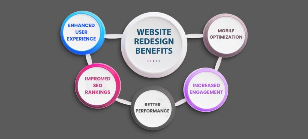
Enhanced User Experience
According to Google, mobile devices account for more than 50% of all web traffic. The same survey found that if a website is not responsive and provides a poor mobile experience, consumers are more likely to quit and never return.
A responsive website aims to deliver the same experience on phones and tablets as it does on desktop screens. This ensures that all website content (pictures, text, links, and videos) are equally accessible on smaller screens.
Improved SEO Rankings
As search engine algorithms change, websites must adapt to stay relevant. Google alone performs 500 to 600 modifications to its algorithms each year. Natural language is increasing popularity, thus websites’ content must be updated to score well in searches. Fast website loading also influence SEO rankings, thus improving page load times benefits both SEO and user experience. Upgrading sitemaps, editing copy to incorporate keywords and natural language, developing higher-quality content, and adding adaptive design are all critical enhancements. This is also an opportunity to clear up keyword stuffing and overuse of meta keyword tags, as Bing has already applied penalties for them.
Better Performance
Many websites now offer third-party connectors, stakeholder portals, bespoke apps, and customized content. A redesign can improve backend access for updating material, changing catalog rates and descriptions, posting blogs and testimonials, and granting or removing rights.
Increased Engagement
Data reveals who your target demographic is and what they want. It tells you when they want to learn more about what you’re selling or make a purchase. This information is gathered and saved on the website the visitor contact profile in your relationship with customers management (CRM) solution.
Mobile Optimization
A mobile website is often a less limited way to establish a mobile presence than app development. For starters, app development necessitates the creation of separate apps for multiple platforms (e.g., iPhone vs. Android vs. Blackberry), as well as certification to an app store, making apps far more fragmented and expensive to build, with a longer timeframe until they reach their intended audience. Most importantly, users must download an app before it can be used. A mobile website, on the other hand, is compatible with all modern smartphone browsers, making it more adaptable and cost-effective, with fewer obstacles between you and your target audience.
Of course, some apps are better suited to an app format (interactive games are a prime example), and it is often beneficial to have both an app and a mobile website. However, for a comprehensive mobile presence, a mobile-optimized website is typically a reasonable and effective first step.
How Website Redesign Affect SEO?
A site makeover can be done for a variety of reasons, including branding, technology, traffic, and lead generation.
During a redesign, SEO-related issues may arise, such as content removal. (It won’t rank unless it’s there!)
- Content can be altered.
- Content may shift within the site’s hierarchy.
- URLs may change.
- Page-level personalization may change.
- Additional content can be inserted.
- New parts can be introduced to the website.
- New technologies or features may be utilized.
- New technological issues may arise.
- Internal link structure may change.
- Domain name would change.
- Subdomains and protocols may change.
Any of the above can have a negative impact on your SEO. When there are many difficulties, such as content moving and being relocated to a new URL, it becomes more difficult to determine the main source of problems. Multiple issues can exacerbate your SEO concerns. Do you want to change the domain, hosting, CMS, and architecture of your website all at once? This increases the possibility of SEO difficulties. Discuss this with the team so that you can strike a balance between the desire for change and the requirement to maintain and improve organic traffic. Get SEO involved within the planning stage; don’t try to solve things after production has begun.
SEO Tips for a Website Redesign
Maintain Metadata
Readability is the technique of ensuring that writing on a website is legible for all users, including those with visual impairments. While selecting the right typefaces for your website is a design-oriented step in the production process, it has an impact on not just the visual appeal of your site, but also its branding, user experience, and (albeit indirectly) SEO.
There are no formal guidelines for ensuring that your website’s typography is search engine friendly. Instead, you’ll discover that adhering to many of the stylistic rules for effective UX design coincides with optimizing your site for organic development. In other words, improved readability boosts your site’s metrics such as click-through rates, bounce rates, and time on page—all of which are positive signals to Google.
Optimize Content
One of the most important places where user behavior and SEO are constantly “on the same page” is your site’s information architecture. Information architecture is the process of organizing, categorizing, and structuring your website’s material to create a logical pattern that people can follow. Information architecture includes more than simply ornamental layouts.
• Website content layout
• Navigation menus
• Categories and subcategories
• Tags or descriptive labels
• User experience and journey
• Sitemap creation
Ensure Mobile Responsiveness
So, if your site’s design is not suited for smaller displays, you will miss out on engaging with a large number of potential visitors. Prioritizing the demands of these mobile users when designing a website leads to a better browsing experience and a higher likelihood of ranking. In reality, in 2016, Google declared that it would begin employing mobile-first indexing.
By making your website fast-loading and easy to browse for mobile users, you enhance the likelihood that they will stay on your site longer and engage with your content. Google sees mobile design as an SEO consideration because it can influence things like bounce rate and page load speed, in addition to engagement data like time on site and pages per session.
Improve Site Speed
According to web design statistics, 42% of visitors leave a website due to poor functioning. This suggests to search engines that users cannot locate what they’re searching for on your website, resulting in lower ranks. Visitors want sites to load quickly, and if they don’t, they’re likely to leave your site and look elsewhere.
When designing your site, it’s critical to consider website performance by increasing page speed and other Core Web Vital elements. Optimize your photographs and media while maintaining quality. This involves using the appropriate formats and specifying image dimensions to reduce load time.
Conduct an SEO
The greatest websites should also be optimized for conversion, and the SEO efforts stated should not detract from your business objectives.
Audit
Optimize your website’s “above the fold” section for high conversion rates. Ensure that it contains H1, CTAs, and graphics.
Monitor Analytics
Use obvious Requests for action that stand out visually, are strategically placed, and are designed and written in a way that will engage visitors. Use a lightbox to accentuate crucial messages.
Test & Monitor After Relaunch
A/B tests your site’s design, copy, and CTAs to determine the most effective elements for conversions. Redesign your website if necessary don’t be afraid to do it.